Ads that sell
The first ad creative checklist, for a shop that has never run an ad
In short
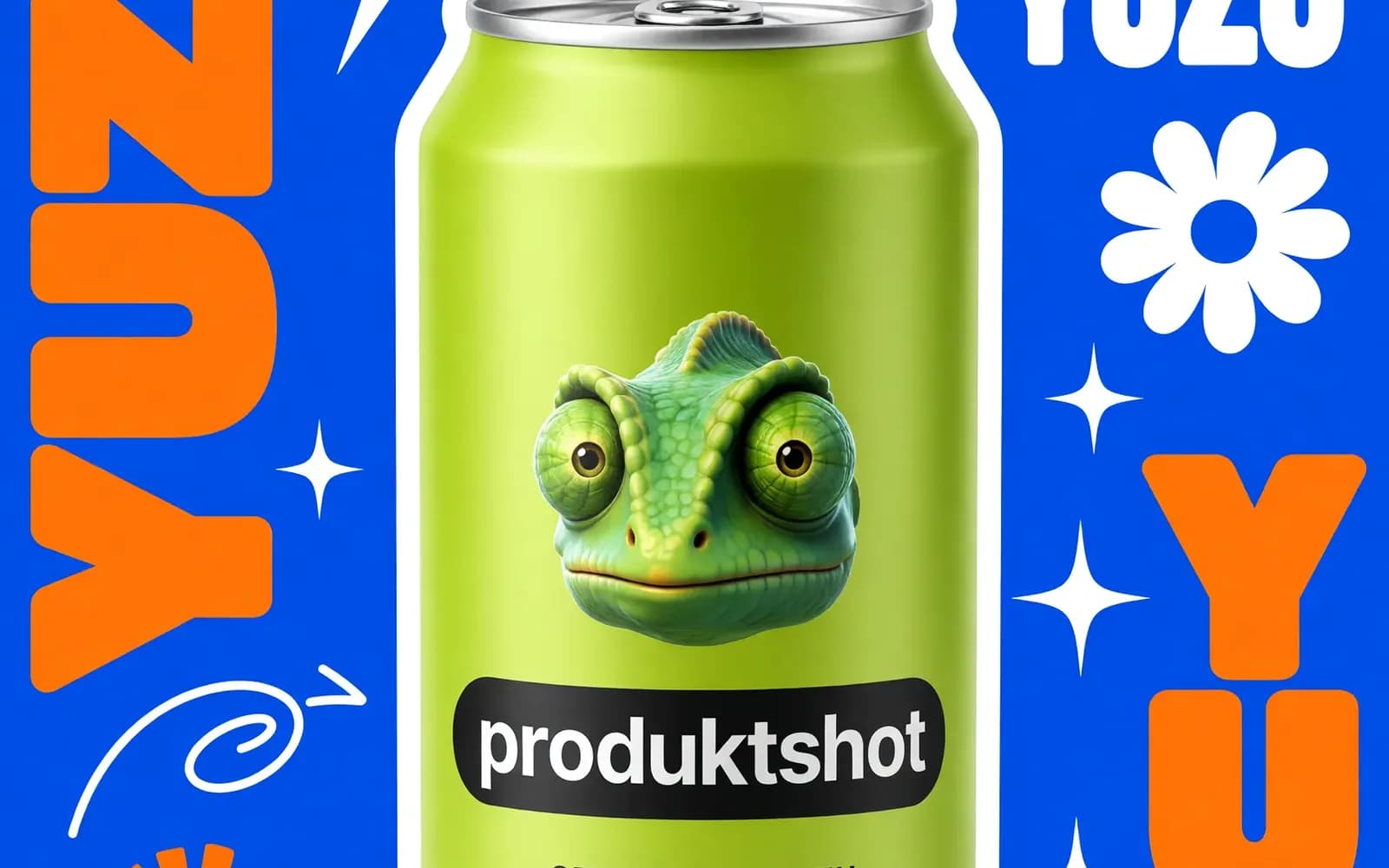
People take in an ad in a fixed order: the image as a shape, the largest text, the product, then the rest. Design in that order: one high-contrast shape, the offer in the biggest text, a product nobody can mistake, one ask, nothing essential near the edges, and three versions that differ in one thing each.
What gets seen, in order
A first ad rarely fails because the design is ugly. It fails because it asks for attention in the wrong order. Someone scrolling decides in a moment whether to stop, and in that moment they take in one shape and one impression, not your words.
- The image, as a shape, before any detail.
- The largest piece of text.
- The product, if it is not already the shape.
- Everything else, but only if the first three earned it.
Design from the top of that list. Most first ads are designed from the bottom.
1. One shape, high contrast
At a glance an ad is not a scene. It is a light area and a dark area. If they make a clear shape, the eye stops. If the whole frame is mid-grey with the product in the middle at the same brightness, it does not.
The test: shrink the ad to thumbnail size and squint. Can you still tell there is a thing in the middle? That is all the first glance delivers.
2. Say the offer, not the category
The biggest text should say what someone gets, not what the thing is.
- "Handmade ceramic mug" names the category. They already know what a mug is.
- "Keeps coffee hot through a meeting" says what changes for them.
If the one benefit is hard to name, that is useful to know: the offer needs work before the creative does.
3. Keep the product recognisable
A common mistake is a beautiful scene in which the product is small, half hidden, or one of six objects competing for attention. If the product is not the first shape, it has to be the second thing found, and unmistakable. Props are there to point at the product, not to share the frame with it.
4. One ask
Not "shop now, follow us, use this code and see our story". One. The ad has one job, the next click. Everything else can happen on the page it leads to.
5. Make it work with the sound off and the edges cropped
Assume no sound, and assume every placement crops the edges differently. So keep nothing essential in the outer margin, and nothing that only makes sense with audio. Platforms change their crops often; keeping the important part well inside the middle of the frame is the version of this rule that keeps working. The current sizes, with their sources, are in social media ad image sizes.
6. Make three, not one
Nobody can tell in advance which creative works. The point of a first campaign is not to be right. It is to find out cheaply.
Three versions that differ in one thing each, the scene, the headline or the product's angle, tell you something after a few days. One version tells you nothing, because there is nothing to compare it with.
This is the real case for generating creatives: not that a generated image beats a photographer's, but that three cost little more than one, so you can afford to be wrong twice. ProduktShot's ad posters turn one product photo into a finished poster from 122 templates, with the headline written for you, from 3 credits a poster.
The checklist
- At thumbnail size, is there one clear shape?
- Does the biggest text say what the customer gets?
- Is the product unmistakable within the first second?
- Is there exactly one thing to do next?
- Does it survive cropped edges and no sound?
- Do I have three versions, each different in one thing?
What this does not cover
Targeting, budget and bidding are a different subject, and once the creative is competent they decide more of the result than the creative does. This list gets you to competent. On its own it does not make a working campaign. Before the ad, check the photo it is built from: eight AI product photo mistakes.
Try it on your own product
Sign up and get 16 free credits, no card needed. The price of every job is on its button.
Questions
Three, each different in one thing: the scene, the headline or the product's angle. One version tells you nothing, because there is nothing to compare it with.
What the customer gets, not what the product is. "Keeps coffee hot through a meeting" sells; "Handmade ceramic mug" only names the category.
About this article
ProduktShot Team
The people who build ProduktShot
We build ProduktShot, an AI product photo studio for online shops, and we write about what we learn doing it: what makes a product photo look real, what marketplaces ask for, and where AI images still go wrong. We run the tools we write about on our own demo products every week.
Facts checked 23 September 2026 against the sources listed under the post.
How we write